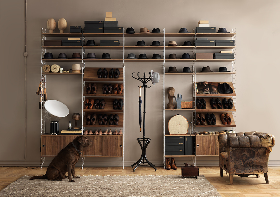
If you knew me about ten years ago, you’d probably find me going through the very darkest corners of every second hand store in Stockholm in search for that perfect String. The String shelf, that is*. Everything mid century modern was on the rise and I was looking for my holy grail: black panels with three shelves in deep, dark read teak. But as always with the holy grail there is a catch. 1.) It had to be cheap, and 2.) it had to be in good condition. Cheap, because I was a student and couldn’t afford to spend any money on anything other than rent, food and school books. And in good condition, because the fact that I didn’t have any money didn’t affect my standards and expectations of iconic furniture.
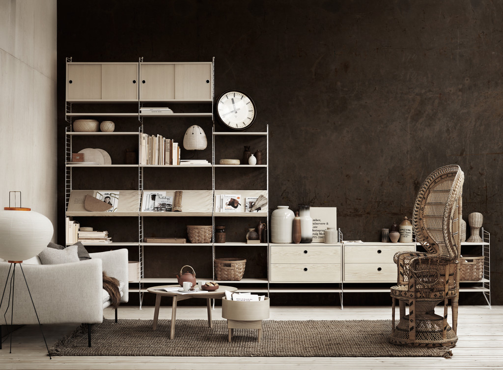
My interest for this epic search however, started to dwindle after dragging B with me into at least three second hand shops one afternoon. When he found out what I was actually looking for, he proclaimed his utter disapproval and lack of understanding why any one in their right mind would ever pay money for these shelves. I was gobsmacked and angry. I understood in that moment that I would never be able to decorate our home with the String shelves I’d so been dreaming of. Just as well, cheap and beautiful in mint condition just didn’t exist. The hype had become a fact.
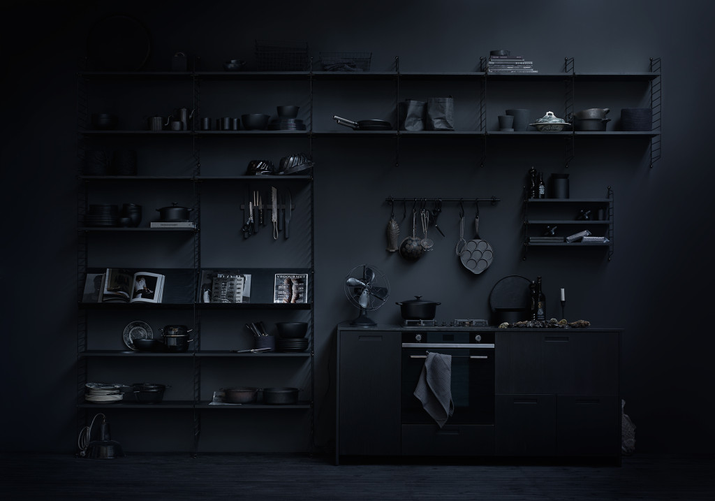
Ah, all black, an obvious favorite of mine!
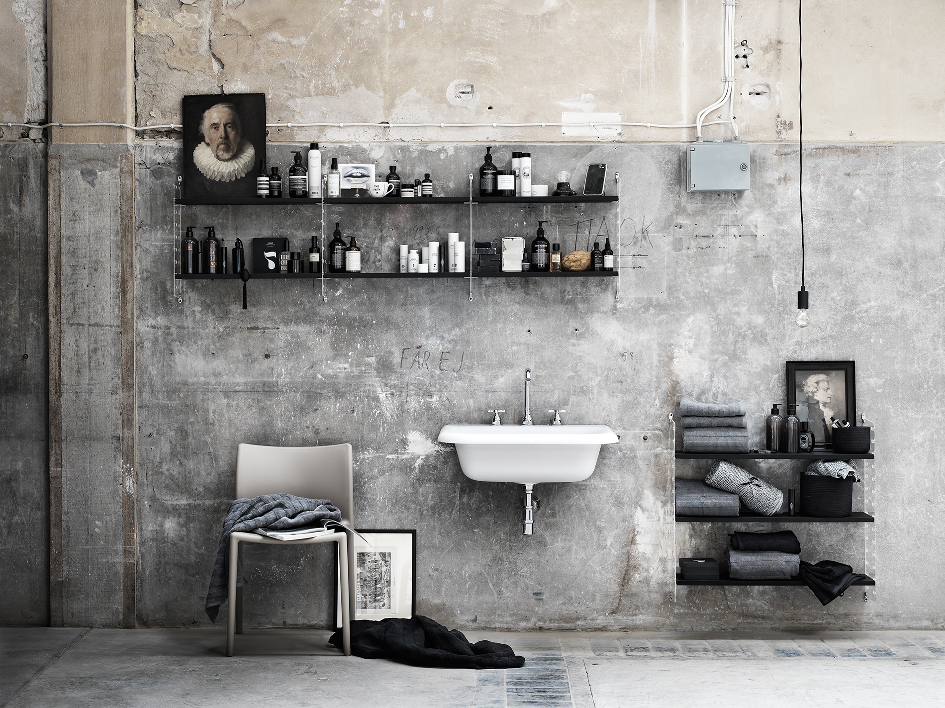
Early this year String launched their new catalog for 2016/17 styled by Lotta Agaton.** After not having given the String much thought for the past eight or so years, there it was in new packaging and styled for all the classically modern interior design nerds out there.*** I was smitten all over again. Lotta had done a great job, by styling the different images in color themes. Either monochromatic, which I absolutely love! Or with an interesting backdrop that both contrasted and complimented the shelving system at display. All blacks, dusty pinks (you know how much I love my dusty pinks), industrial environments or a great big pop of color. “All in” sums it up nicely. For each theme she went all in and made it beautiful and elegant.
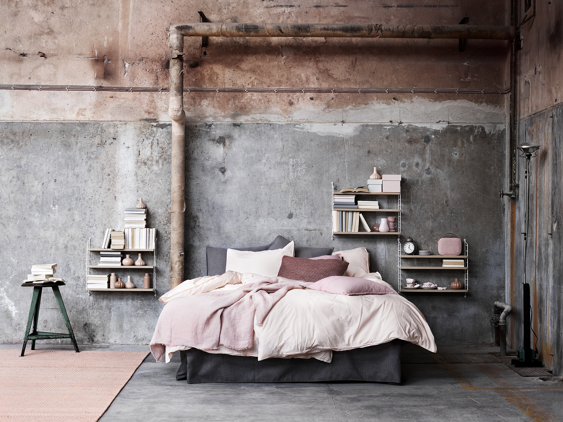
And although I’m quite sure I’ll never put up that String shelf in a home I share with B, it might be worth showing him the catalogue, just in case. Stranger things have happened…
I’d love to hear your personal stories, do you have an early memory or attachment to a certain design piece? Leave me a comment below.
*Designed by Nisse Strinning in the late 1940’s
**Blogging interior stylist based in Stockholm
***Yes, that’s me…
This post consists of my own opinions and was not endorsed in any way by String or Lotta Agaton.

