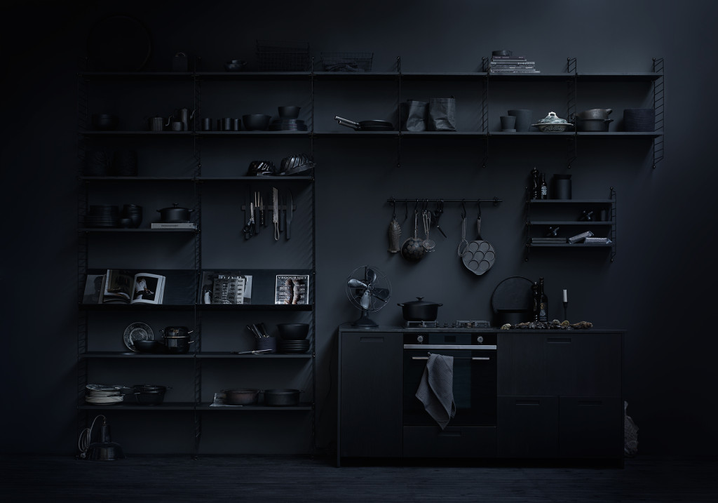
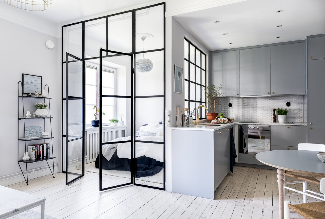
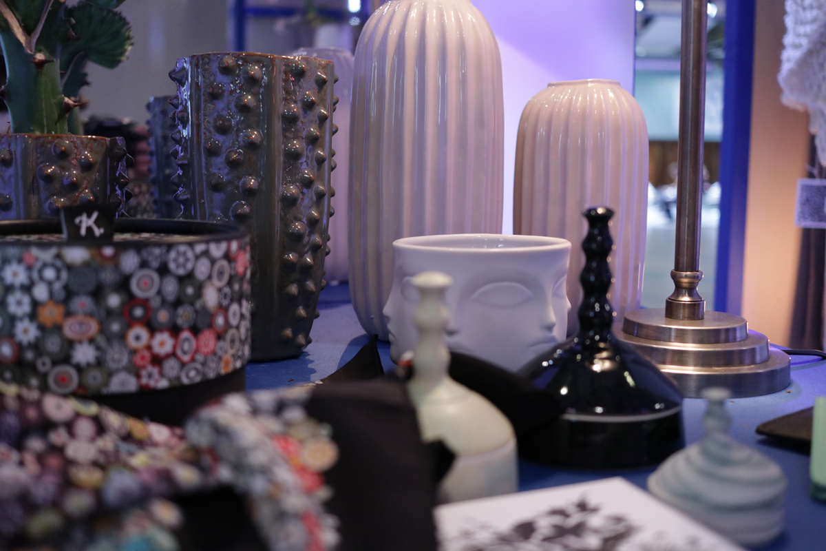
As our days are getting increasingly shorter (even here in Tel Aviv) it got me thinking about the obsession we Swedes have for light and bright interiors. White is everywhere! We even have a color named Stockholm white, and you’ll find it on the walls of every other home in Stockholm. Try to find a real estate ad that doesn’t have the words “ljust och fräscht”* in the description of a newly renovated flat is as likely as finding a minimalist who doesn’t like the color combination black and white. And lets face it, it is the foundation of the Scandinavian design scene. But working with interiors, white does get a bit limiting and I’d like to mix things up a bit. That’s why I wanted to talk to you about dark interiors. Now this is a topic that can be a bit scary to bring up, because you never know what reactions you’ll get. But let me explain, and you can leave me your reactions below 😉
Author: Caroline
Winter is coming
Come the colder months of the year we spend more and more time inside. I recently got a few photos from home, where they are having the most beautiful winter wonderland. Stockholm is beautiful at winter, but cold and it’s hard not to long inside. Hence we want to make it as warm, cozy and welcoming as possible. I tend to want to bring in loads of greens. Evergreens, Conifers, Hyacinths, Eucalyptus (looks good all year round), Christmas rose, Amaryllis, Holly, the list goes on… Read More
Ein Gedi – A lung in the desert
By now, you’ve probably figured out that, whilst I’m a city dweller, I love sightseeing in nature! Our trip to the Dead Sea region was no exception. After taking a dip in the Dead Sea, we went on to the national park Ein Gedi. Being a bit tired and not wanting to get overheated in the sun I wasn’t overly excited to go here. But it felt a shame to miss now that we were in the region. And I’m so glad we didn’t miss it! Read More
The colors of fall
Fall is here, with all its colors. Even though it means that it gets colder and darker, the fall air is crisp and clean and the color palette is the most incredible. And not to mention the hottest pallet around, come 2017. Read More
Saving space
This is the longer version of the article I wrote for BoConcept on my top five space saving tips.
As a Scandinavian designer and a Swede I know a thing or two about practical home interiors and minimalist living. Swedes love being practical. So much so that we sometimes forget, or don’t care about, how things look, as long as they fulfill their purpose. We are also used to living in small spaces, especially in the cities. Hence the birth of Scandinavian minimalism.* However the design of an object and how it looks is all part of it’s practicality. Form is function in my opinion. So here are my five top tips on how to save space both practically and beautifully. Read More
Moving to the Middle East
Ah, it feels good to be back on the blog! Sorry for being all “Quiet on the Western Front” the past month. It is partly due to the fact I just moved to the “Eastern front”, more precisely Tel Aviv, Israel. Maybe not the obvious choice for a Swede, as it is smack, bang in the middle of the Middle East*. But hey, when opportunity comes knocking…
It has been very exciting and I didn’t really know what to expect. Luckily B. picked me up at the airport and swept me off my feet my very first day here. And what a treat I was in for, I thought you might want to tag along! Read More
Designer Obsession – Patricia Urquiola
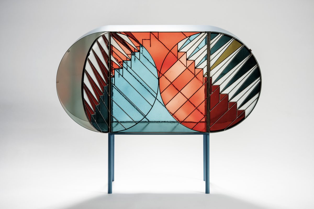
During this years Milan Design Week, Spazio Pontaccio launched the Crendenza collection. A series of furniture in stained glass inspired by the windows at holy sites created by industrial designer and architect Patricia Urquiola and graphic designer Federico Pepe. This collection shows everything I like about Patricia Urquiolas work. Her designs are not constrained by a certain aesthetic and it boasts with magnificent shapes and playfulness. Now her work isn’t for everyone, but it isn’t meant for everyone either. And in that lies her strength. As a younger and much more inexperienced designer this fills me with awe and inspiration. Having the guts not to try to please everyone. At least that is what her designs say to me. Just like art, the interpretation of design is highly subjective and personal *note to self*. Read More
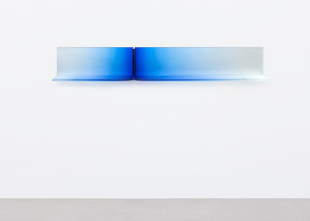
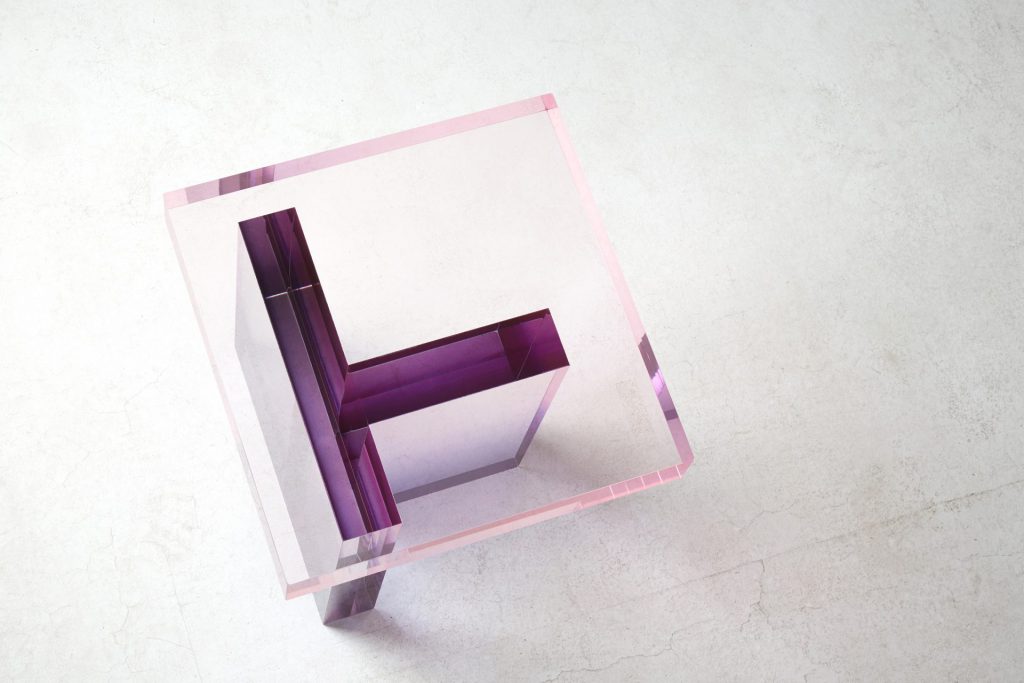
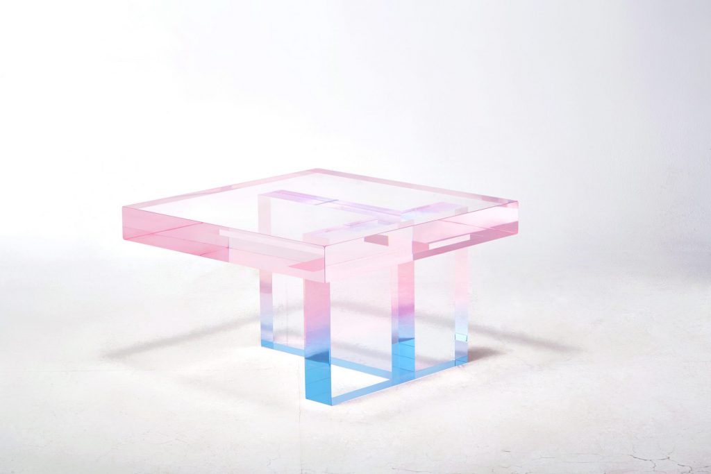
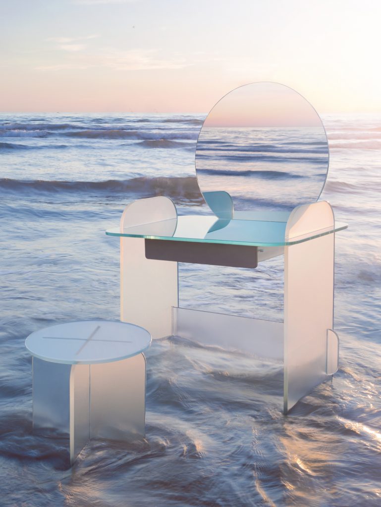
Trending – colored glass
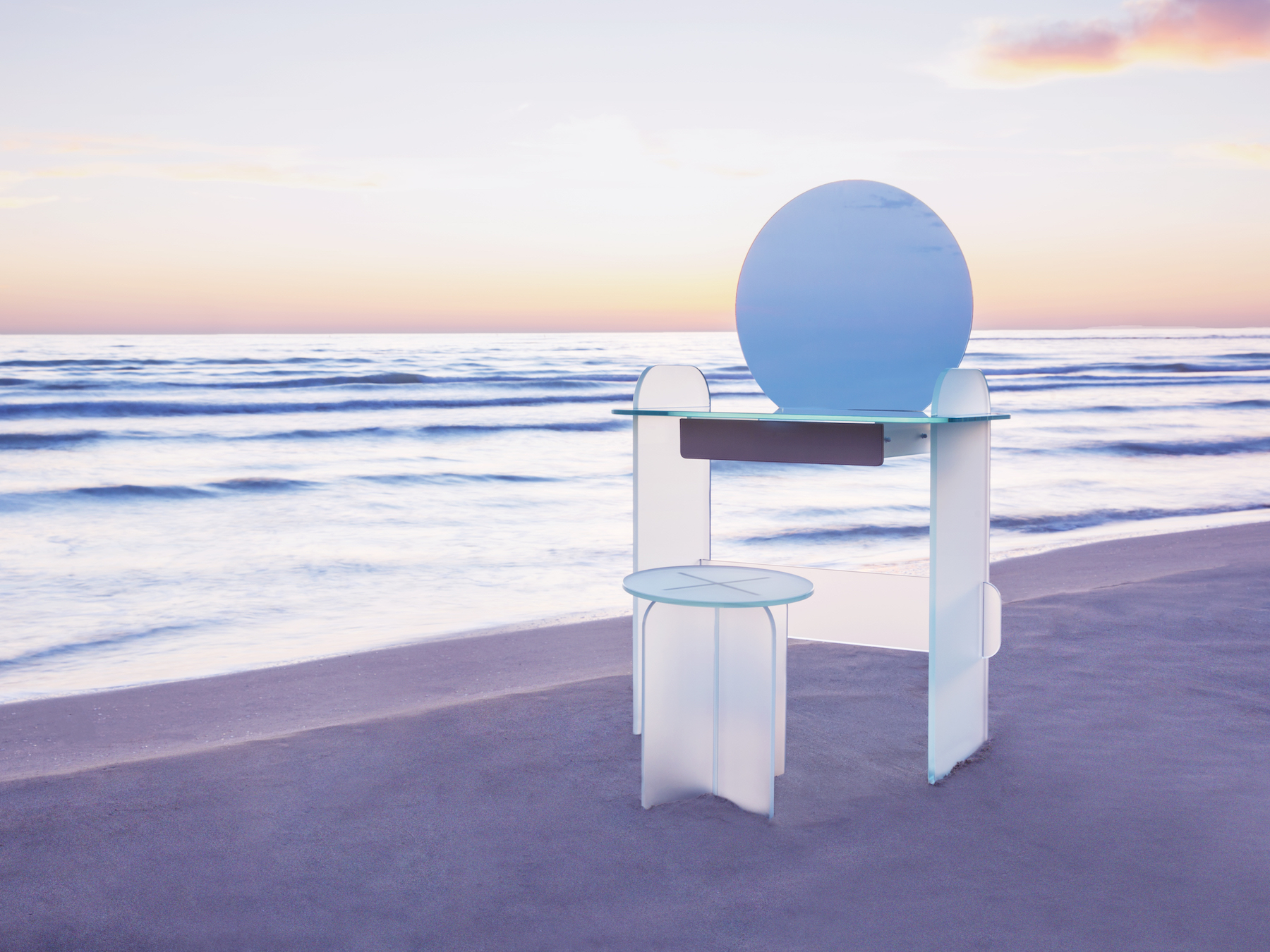
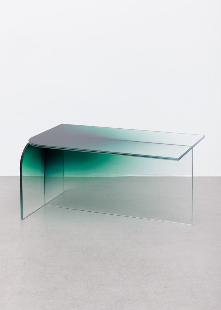
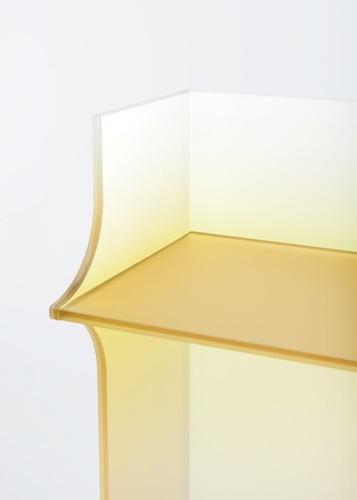
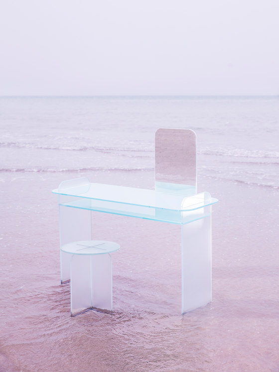
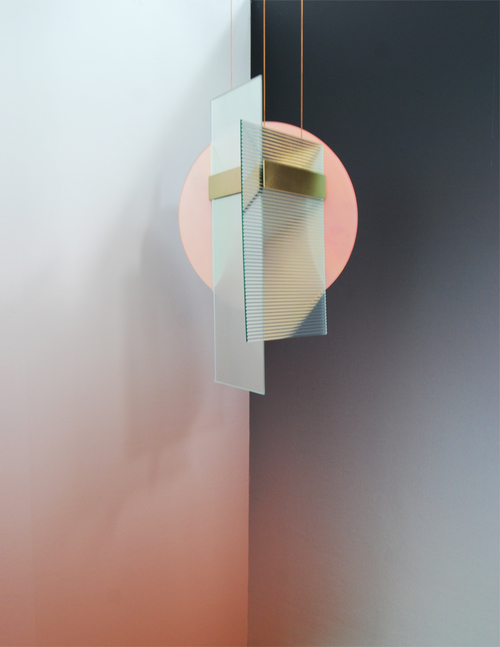
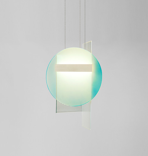
Lately I’ve seen this trend popping up in my Instagram feed, on Pinterest and most everywhere. It’s totally trending! Beautiful glass furniture lightly colored in new and innovative ways. It’s a great way to integrate bright colors in an otherwise sober interior. And many sporting lush, round shapes, naturally I’m a big fan of those! Have a look below and see if you feel the same?
What do you think? Isn’t this trend amazingly welcome?
Click on each image for product source.
Daily sketch – Silk carpets
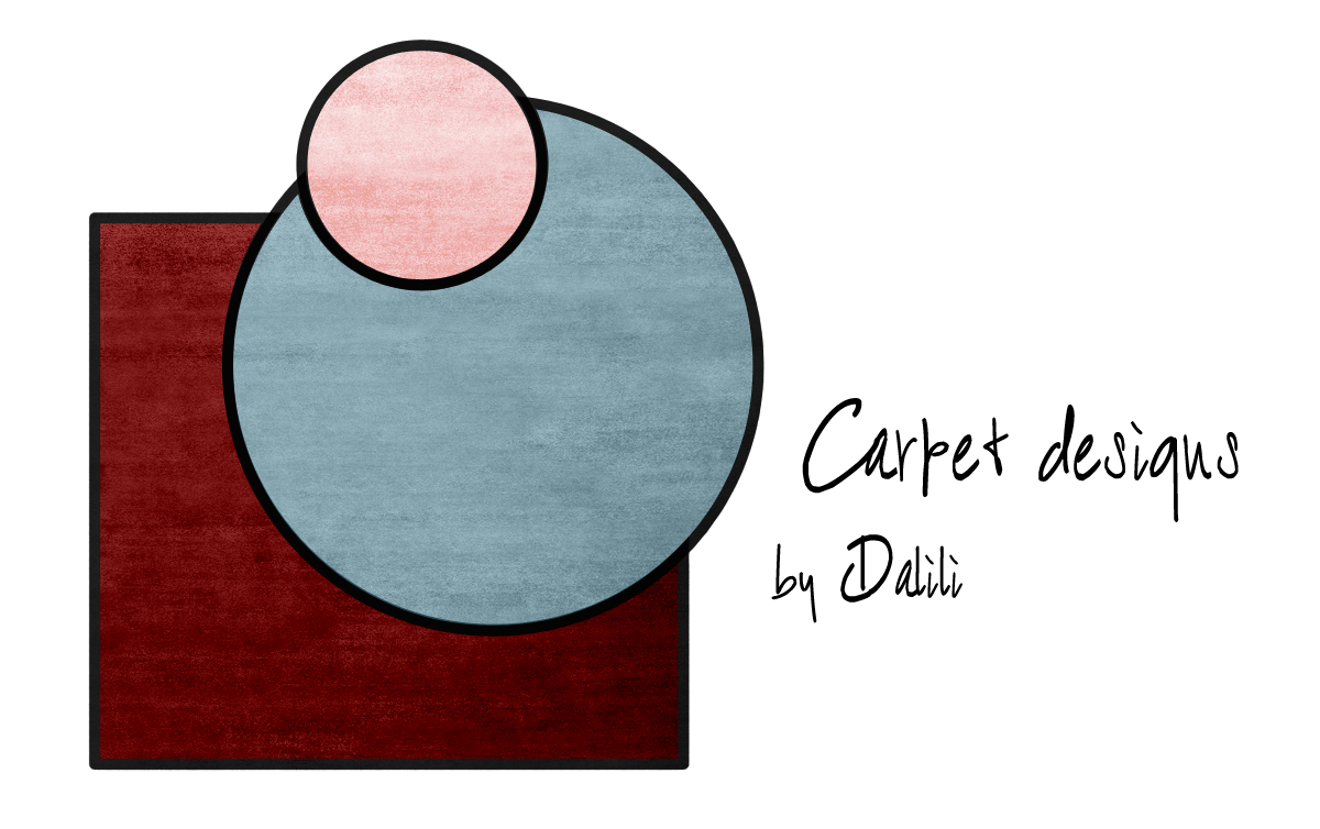
I’ve been thinking about doing a carpet design for a long time. But I haven’t know exactly what I wanted to do. From my experience of selling carpets I’ve learned that many times the size of both rectangular and round carpets can be tricky to get just right for a specific layout in a living room. This is often due to the fact that the layout in which the furniture is placed is seldom symmetrical. This thought sparked an idea and inspiration struck. Read More
Formex Sthlm
Yesterday was the last day of the Formex fair here in Stockholm. As they say themselves, Formex is the largest meeting place for Nordic interior design. So what does this mean in terms of what is actually on display here? It is mostly interior accessories, not excluding furniture but it is not the main focus, and lifestyle brands, where you can find everything from chocolate covered licorice and table ware to fashion and personal accessories. There is also a kids section, body & bath and floral & garden. Although I walked through most of the fair, I kept mostly to the interior accessories area. Read More

