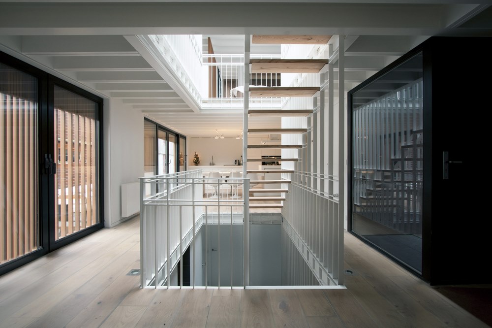
Being engaged to a former sailor we have naturally had the talk “Is living on a houseboat an option?” because lets face it, the Stockholm housing market has been spiraling out of control and you have to be smart and think outside the box sometimes. However, it has always been a definite NO for me*. That was until I saw the Water Villa in Amsterdam designed by FRAMEWORK Architects & Studio PROTOTYPE. I can totally see myself floating around in this airy and light space divided up into three(!) floors. Read More
All posts tagged: Interior design
Dalili Design – Made in Sweden, and why it’s so important
Why is Made in Sweden so important to me? When I started Dalili design four years ago it was a no-brainer, I wanted my products to be produced in Sweden. It might not be the smartest move financially. The margins are substantially smaller, even a small collection requires relatively big investments and because of this, things can some times take a lot longer. But it ensures that my products are ethically produced, in a country leading the way for efficient energy use and sustainability. Where emissions from long transportation routes is kept to a minimum. And I can focus my efforts on creating high quality products that lasts.
Philosophy
Dalili design is above all about beautiful design. Part of what makes the designs so beautiful, to me, is the conscious decisions of ethical and sustainable production. These are core values not only to me as a person, but also to my brand. I mean, how can you run a business that doesn’t share your values? Our products are industrially made, heightened by the craftsmanship of the final details. This way we combine the best of both worlds, and support our local industry and skilled craftswomen and men. I want Dalili design to be a brand that costumers can count on in all fields. Joining the movement of sustainable and ethical design, advocating to leave cheap throwaway products behind.
In the future
Looking to our future we want to work with new innovative materials and techniques. A lot is happening on the front of smart fabrics and ethical alternatives to leather. Not to mention the great wave of possibility the 3D-printing technology presents. Now, I realize we can’t expect all this to be made in Sweden alone. There are plenty of companies around the world that focus on ethics and sustainability, same as us. I look forward to find like-minded people and companies, and to work with skilled craftspeople around the world. Dalili design will always be a Swedish company with high regard for all life, human, animal and nature alike. For the share joy of it, we will keep producing in Sweden, but our doors are always open to new, exciting ventures and collaborations outside our borders too. A Swedish brand on the global market, a thought that I find very exciting!
Do you know of any new innovative products and materials we should know about? I’d love it if you shared it with us in the comments below! Don’t forget to like this post if you did <3
This slimlined hostel design in Bangkok is genius!
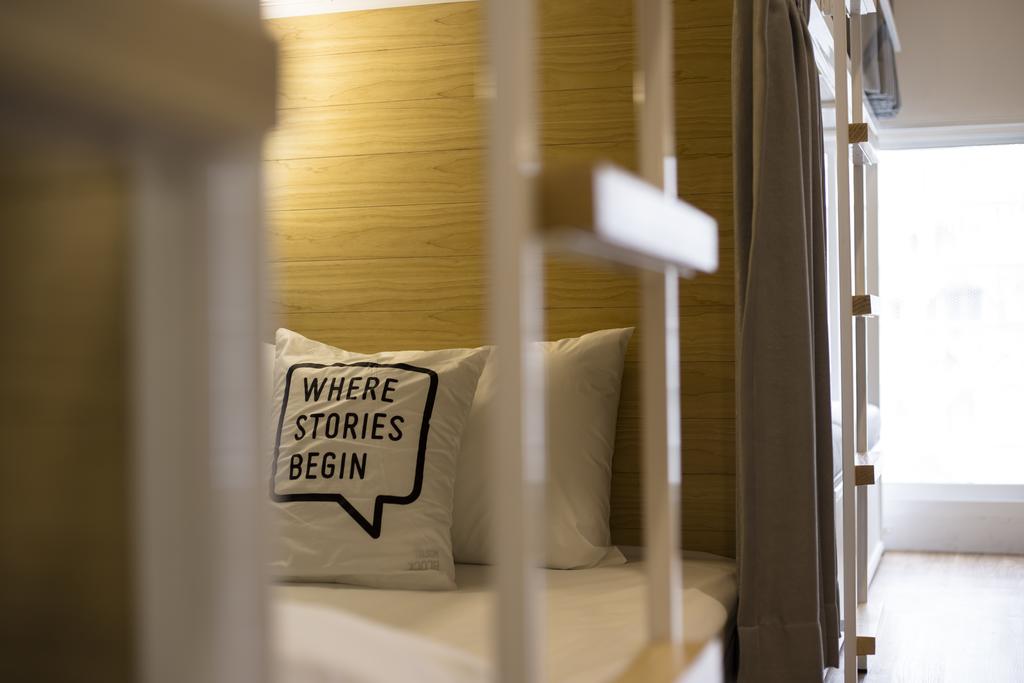
Since we have just landed in Thailand I wanted to see what the hotel scene has to offer. I discovered this Bangkok hostel, that has made the most out of their space by using clever design. The Bed One Block hostel that opened in 2016, has gotten the balance just right utilizing the space they have in the best way possible. Read More
Design trends for 2017
A few weeks back I attended Stora Trenddagen* in Stockholm hosted by Trends and Friends. They had summarized what the biggest trend influences will be during 2017. Our lecturer for the day was Swedish trend guru Stefan Nilsson also known as Trendstefan. Now, trends isn’t something I tend to focus too much on, and I think you should take (or not) what you want from them. That said, being conscious of trends can serve you well, especially if you are an early adapter. So they are not to be ignored.
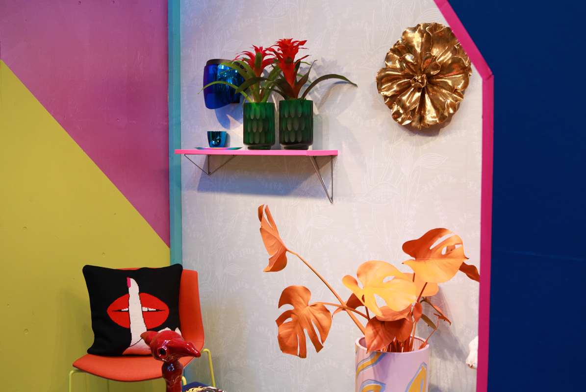
The trends for 2017 were broken up into five distinct groups, each group named after it’s characteristics; Read More
Barely there
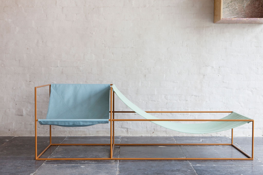
To be able to convey a shape or a form with only a few lines on a paper is amazing. To be able to do it with furniture adding in the element of function is a true art. The barely there style, as I call it, has been in the spotlight for some time and companies like &Tradition with their Palette collection and Gubi with their Ganfratesi tables has really put the style in the eyes of the public. The Belgian design duo Muller Van Severen has made a whole collection with barely there furniture. Perhaps not surprisingly, they are both artist choosing to create furniture hanging in the balance between art and design. As they say “it’s obviously ‘furniture’ but the emphasis is not completely concentrated on function and suggests different ways of living and use of space… an uncanny twist on universal forms.” Read More
The Devil’s in the details
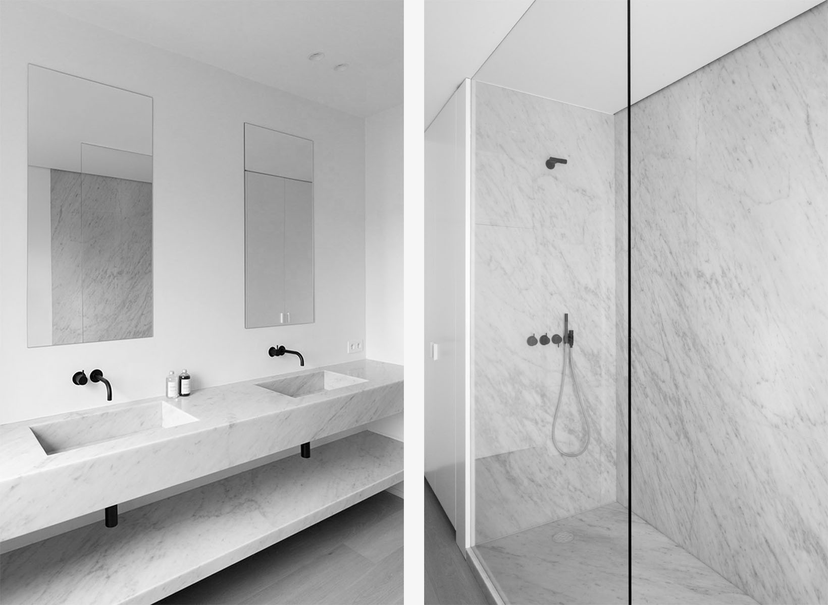
Never more so than in Scandinavian design are the details so important. I would even go as far as to say that they carry the whole. With the minimal color choice of black, white and different shades of grey and the clean cut lines there is little room for error. One shelf hanging off center will ruin the whole look. But when done right, the lines, curves and simplistic color scheme comes together to create a harmonious atmosphere. And a simple bottle of soap can become a beautiful decoration. So to break off from the multitudes of Christmas decorations this time of year I thought I’d give you some Scandinavian monochrome inspiration. Read More
The dark side
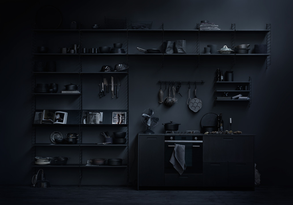
As our days are getting increasingly shorter (even here in Tel Aviv) it got me thinking about the obsession we Swedes have for light and bright interiors. White is everywhere! We even have a color named Stockholm white, and you’ll find it on the walls of every other home in Stockholm. Try to find a real estate ad that doesn’t have the words “ljust och fräscht”* in the description of a newly renovated flat is as likely as finding a minimalist who doesn’t like the color combination black and white. And lets face it, it is the foundation of the Scandinavian design scene. But working with interiors, white does get a bit limiting and I’d like to mix things up a bit. That’s why I wanted to talk to you about dark interiors. Now this is a topic that can be a bit scary to bring up, because you never know what reactions you’ll get. But let me explain, and you can leave me your reactions below 😉
Winter is coming
Come the colder months of the year we spend more and more time inside. I recently got a few photos from home, where they are having the most beautiful winter wonderland. Stockholm is beautiful at winter, but cold and it’s hard not to long inside. Hence we want to make it as warm, cozy and welcoming as possible. I tend to want to bring in loads of greens. Evergreens, Conifers, Hyacinths, Eucalyptus (looks good all year round), Christmas rose, Amaryllis, Holly, the list goes on… Read More
Saving space
This is the longer version of the article I wrote for BoConcept on my top five space saving tips.
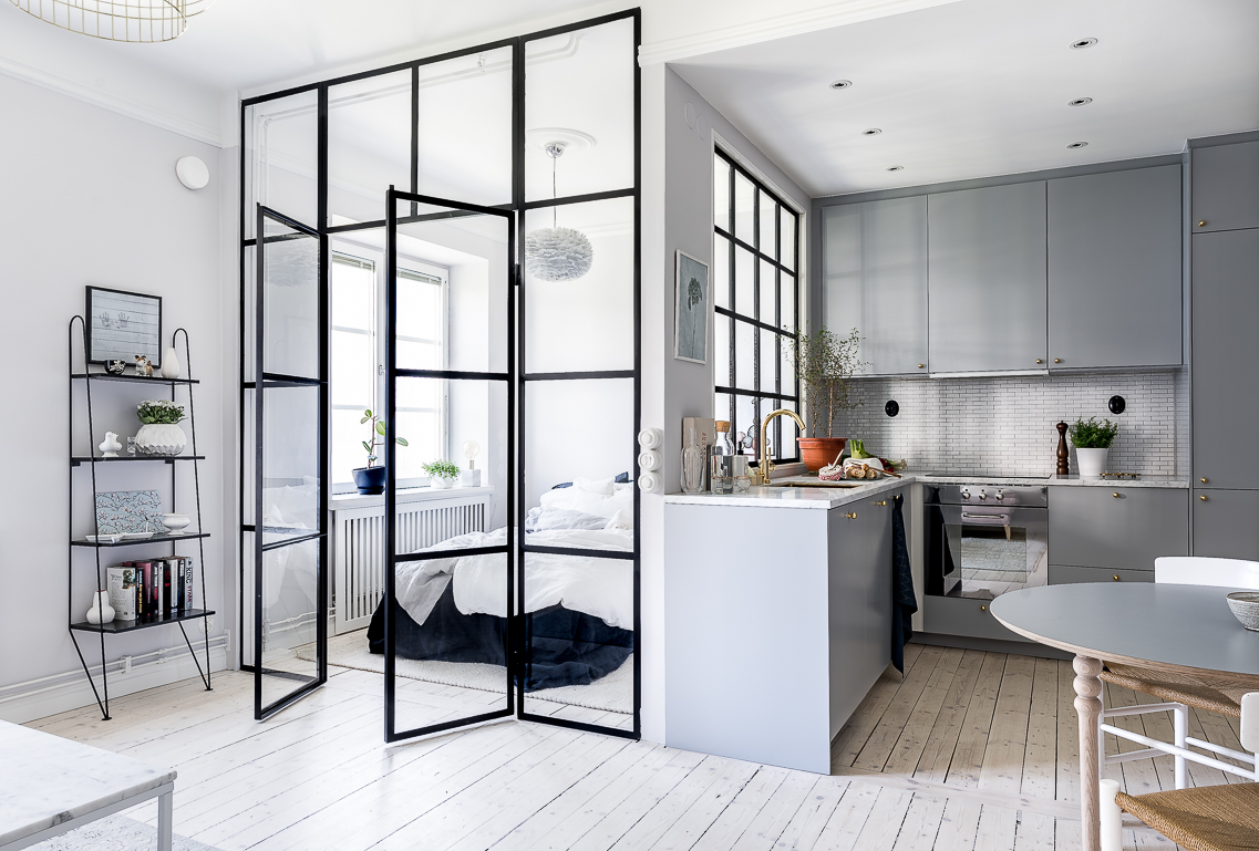
As a Scandinavian designer and a Swede I know a thing or two about practical home interiors and minimalist living. Swedes love being practical. So much so that we sometimes forget, or don’t care about, how things look, as long as they fulfill their purpose. We are also used to living in small spaces, especially in the cities. Hence the birth of Scandinavian minimalism.* However the design of an object and how it looks is all part of it’s practicality. Form is function in my opinion. So here are my five top tips on how to save space both practically and beautifully. Read More
Designer Obsession – Patricia Urquiola
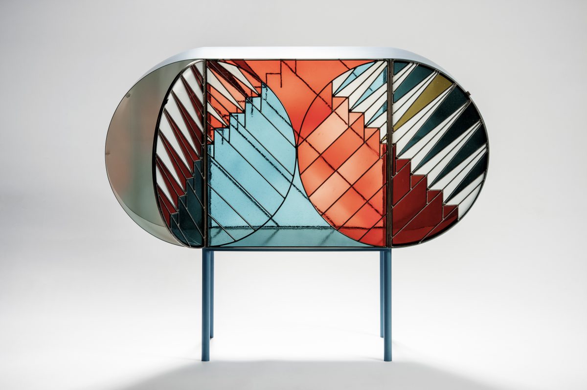
During this years Milan Design Week, Spazio Pontaccio launched the Crendenza collection. A series of furniture in stained glass inspired by the windows at holy sites created by industrial designer and architect Patricia Urquiola and graphic designer Federico Pepe. This collection shows everything I like about Patricia Urquiolas work. Her designs are not constrained by a certain aesthetic and it boasts with magnificent shapes and playfulness. Now her work isn’t for everyone, but it isn’t meant for everyone either. And in that lies her strength. As a younger and much more inexperienced designer this fills me with awe and inspiration. Having the guts not to try to please everyone. At least that is what her designs say to me. Just like art, the interpretation of design is highly subjective and personal *note to self*. Read More

